A Simple Interpretation of p-values
P-values & ice cream consumption simply explained.
P-values sit at an odd intersection — widely used, yet stubbornly misunderstood. This post breaks them down without drowning you in statistical jargon. To ease into it, we’ll start where all good statistics lessons should: ice cream.
The Ice Cream Shop Problem 🍦
Picture a busy ice cream shop on one of Toronto’s liveliest streets — the kind of place that draws a steady crowd of hundreds daily. This is where I find myself on a warm Sunday afternoon, ordering my usual: strawberry 🍓. Between bites, curiosity gets the better of me. I turn to the owner and ask how many ice creams she thinks the average customer buys in a week. She pauses, shakes her head, and says:
“Hmm, I’d say the average customer buys around 3 ice creams a week — give or take one.”
I thanked her and made my way to a nearby bench to enjoy my scoop.
But as I sat there, something caught my attention. People weren’t just passing through once — some were looping back multiple times in the same afternoon. I found myself thinking: those regulars are almost certainly coming back before the week is out. A quiet suspicion started to form. Was the owner’s estimate actually accurate? What if the average customer was buying considerably 3+ a week? Given how good the ice cream was, it wouldn’t exactly be shocking.
I’m not one to sit with an unanswered question when data can settle it. So I did what any self-respecting data enthusiast would do — I decided to run a proper statistical analysis. Specifically, I set up a hypothesis test, the kind you might know as an A/B test, to put the owner’s claim to the test.
My first step was to sketch out a distribution using the numbers she gave me:
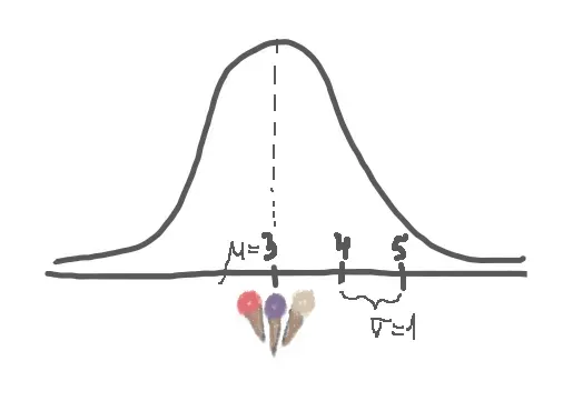
I assumed that my data is approximately normally distributed with a mean = 3 and standard deviation = 1. Keep in mind that not all real life data is normally distributed though! [image is my own]
In an A/B test, you pit a control group A — the status quo — against a treatment group B. Here’s how the two sides shape up in our case:
- A: The average customer buys 3 ice creams per week.
- B: The average customer buys more than 3 ice creams per week.
If I can find enough evidence to reject A in favour of B, my suspicion is confirmed.
But evidence doesn’t appear out of thin air — I need data. My plan: track n = 50 customers, observe their habits over a week, and record how many ice creams each of them buys. A reasonable sample size to work with.
Fast forward through the data collection, and here’s what I found: the average customer in my sample ordered X̄ = 4 ice creams that week. Already, that’s nudging past the owner’s claim of 3 — but is it enough to conclusively call her out? A difference of 1 could easily be random noise. I need a more rigorous way to evaluate it.
That’s where a test statistic comes in. Since we’re comparing sample means, I’ll use one of the most common tools for the job:
Z = (X̄ − μ) / (σ / √n)
Side note: The test statistic you use depends on what you’re testing. Comparing proportions? Testing multiple groups at once? There’s a variant for that. You can explore the full lineup here.
Looking at the Z test statistic formula, the logic behind it is fairly intuitive. We take the gap between what we observed (the sample mean X̄) and what we were told to expect (the hypothesized mean μ), then scale that difference relative to the sample size and the theoretical standard deviation σ. The result tells us how far our sample mean has strayed from the theoretical one — in a standardized, comparable way.
Plugging in our numbers — μ = 3 and σ = 1 from the owner’s claim, X̄ = 4 from our data, and n = 50 from our sample size — we get:
Z = (4 − 3) / (1 / √50) = 7.07
So we’ve landed on a Z-score of 7.07. But a number on its own doesn’t mean much — what do we actually do with it?
We plot it. Specifically, we place it on a graph alongside the hypothesized Z-score of 0 — because if the owner’s claim were perfectly accurate, there would be zero difference between what she described and what we observed, giving us Z = 0.
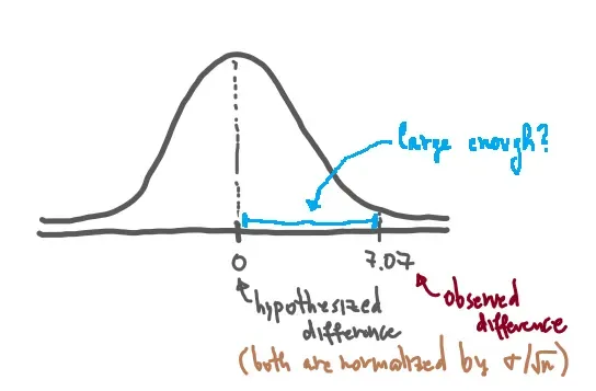
And there it is: A vs. B in plain sight. The status quo sits at 0 — no difference, owner vindicated. Our observed result lands at 7.07 — meaning our sample mean is 7.07 standardized units away from what we were told to expect. If you strip away the normalization and return to raw values, that’s a gap of 1 ice cream per week.
Which brings us to the real question: is that gap meaningful?
Is 7.07 units of separation enough to confidently say — “I have sufficient evidence to reject A and go with B”? Or could this kind of difference plausibly show up by chance, even if the owner was telling the truth all along?
That’s exactly what we need to figure out next.
Bringing p-values into the picture
We’ve reached the moment of decision — but we’re not quite ready to make one. That’s where the p-value steps in. Here’s the formal definition: the p-value is the probability of obtaining results at least as extreme as those already observed, assuming the null hypothesis (A) is true.
In plain terms, the p-value is simply the green shaded area in the graph below: the probability of observing a result even more extreme than the one we already got (X̄ = 4).
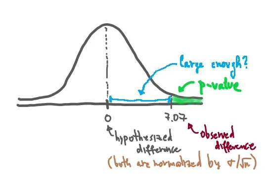
In our example, that green area is nearly zero — though the illustration above exaggerates it for clarity, so don’t let the visual throw you off. 😊
Here’s the key intuition: the further our observation sits from the hypothesized mean, the smaller that tail area becomes. And a smaller area means two things simultaneously — it’s increasingly unlikely we’d see something even more extreme, and the evidence stacking up against the status quo is increasingly hard to dismiss.
Calculating the p-value is, in practice, a matter of finding the area under the bell curve beyond our observed result. Formally:
p = P{Z ≥ z} = P{Z ≥ 7.07} ≈ 0
Side note: I used this z-score table to arrive at that result — a handy reference worth bookmarking if you work with inferential statistics regularly.
So how small is small enough?
A p-value of nearly zero is compelling — but we need a predetermined benchmark to measure it against. That benchmark is called the significance level, or alpha (α), and it’s set before the experiment begins. This matters: locking in the threshold upfront is what protects against p-hacking — the temptation to shift the goalposts after seeing the results.
The most widely used threshold is α = 0.05, or 5%. In more high-stakes fields like medicine, you’ll often see stricter cutoffs.
The decision rule is straightforward: if p-value < α, reject A in favour of B.
In our case, p ≈ 0, which is comfortably below 0.05. We reject A. The evidence supports B. People really do buy a lot of ice cream. 🍓😃
A few closing notes
Note 1: This post deliberately stays focused on p-values. There’s a lot more that goes into a rigorous A/B test — sample size selection, statistical power, effect size — but those deserve their own treatment.
Note 2 — Homework: What would happen if we had observed X̄ = 3.2 instead of X̄ = 4? Try calculating the p-value yourself, and sketch out the graphs if it helps build your intuition. Would you still have enough evidence to reject A? How does the shift from 4 to 3.2 change the picture? Drop your thoughts in the comments below! 👇